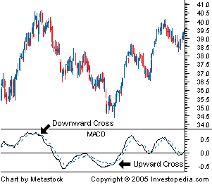
• Home
  • Watchlists
  • Education
    • Technical Analysis
    • Trading Psycology
    • Trading Strategies
  • Book Reviews
  • Services Reviews
    • Tim Sykes
      • Tim Sykes's Millionaire Challenge
      • Penny Stocking Silver
      • Tim Sykes DVDs
    • Jason Bond
    • Bulls on Wallstreet
    • Claytrader

Karma Trades

What is it?

It's a momentum indicator that tracks the relationship between volume and price. It is often considered a leading indicator because it shows when a stock is being accumulated or distributed, foreshadowing major price moves. Again, volume precedes price.

How is it calculated?

The indicator has a three step calculation:
  1. Money Flow Multiplier = [(close  -  low) - (high - close)] /(high - low) 
 
  2. Money Flow Volume = Money Flow Multiplier x volume for the period
 
  3. Accumulation/Distribution= previous Accumulation/Distribution + current period's Money Flow Volume

How to use it?

This indicator is mainly used to confirm trends or spot potencial trend weakness & reversal when there is a divergence with the price trend.


Unlike the OBV, the Accum/Dist Line takes into account each individual period, giving it a different value based on if it cloed near its highs or near its lows. This means that a slightly red hammer day, won't affect the line the same way as a long red candle would, thus allowing to track the volume more accuratetly than the OBV.


Share
Tweet
Pin
Share
No comentarios

What is it?


A stochastic oscillator is a momentum indicator that compares a scurity's closing price to its price range over a given period of time. This oscilator usually has two lines: "%K" that acts as a signal line; the other line is "%D" which is usually a 3-period moving average of %K

How is it calculated?

 
%K = (Current Close - Lowest Low)/(Highest High - Lowest Low) * 100
%D = 3-day SMA of %K

Lowest Low = lowest low for the look-back period
Highest High = highest high for the look-back period
%K is multiplied by 100 to move the decimal point two places

How to use it?

The theory behind this indicator is that in an upward-trending market, prices tend to close near their high, and during a downward-trending market, prices tend to close near their low. Transaction signals occur when the %K crosses through a three-period moving average called the "%D". 


Just like the RSI, the stochastic oscilator can also be used to identify oversold and overbought market conditions.When the stochastic is above 80, it is considered to be overbought; when it is below 20, it is considered to be oversold.

Variants


There are 2 main variants of the stochastic oscillator: The Fast & Slow Stochastic.
 
Fast Stochastic Oscillator: This is the basic formula explained above.
  • Fast %K = %K basic calculation
  • Fast %D = 3-period SMA of Fast %K
Slow Stochastic Oscillator: This form of the stochastic is used to further smooth both the %K and %D lines, reducing the number of false signals.
  • Slow %K = Fast %K smoothed with 3-period SMA
  • Slow %D = 3-period SMA of Slow %K

Comparisons and Contrasts with the RSI

While they are similar and also have similar goals, the way that each of these momentum indicators are calculated makes them better suited for different situations.

The RSI takes the last "n" periods and divides the gross positive changes per period by the gross negative changes. This means that the more often prices move higher in that "n" period span and the greater those changes become, the higher the RSI value.

A Stochastic is the measurement of the placement of a current price within a recent trading range. The theory is that as prices rise, closes tend to occur nearer to the high end of their recent range. When prices trend higher and closes begin to sag within the range it signals internal market weakness.

Simply stated, the Relative Strength Index yields the most meaningful results in trending markets while Stochastics work best in flat or choppy markets. The RSI, as mentioned, helps determine when a price has moved too far too fast. This implies a trending market. Stochastics help determine when a price has moved to the top or bottom of a trading range, which implies a non-trending (flat or choppy) market.


Share
Tweet
Pin
Share
No comentarios

What is it?

Volume is a very simple indicator but also a very powerful one if used correctly. It is a measure of how many shares of contracts of any given financial asset has been trader in a given period of time.

How is it calculated?

Volume is just a count for al the shares that were traded that day. If a buyer of a stock purchases 100 shares from a seller, then the volume for that period increases by 100 shares based on that transaction.

How to use it?

Volume is usually seen as an histogram at the bottom of a price chart. Each bar represents the volume of each period.

Volume is used to measure the worth of a market move. If the markets have made strong price move either up or down the perceived strength of that move depends on the volume for that period. The higher the volume during that price move the more significant the move.

Volume in Trends 

In a rising market volume should be also increasing. This means that the market is finding new buyers to sustain the trend. Increasing price and decreasing volume show lack of interest and this is a warning of a potential reversal. 


This can be hard to wrap your mind around, but the simple fact is that a price drop (or rise) on little volume is not a strong signal. A price drop (or rise) on large volume is a stronger signal that something in the stock has fundamentally changed.


Exhaustion Moves and Volume

In a rising or falling market we can see exhaustion moves. These are generally sharp moves in price combined with also a sharp increase in volume. Exhaustion moves usually signal the potencial end of a trend.
A GLD daily chart showing a volume spike indicating a change of direction.


Participants who waited and are afraid of missing more of the move pile in at market tops, exhausting the number of buyers. At a market bottom, falling prices eventually force out large numbers of traders, resulting in volatility and increased volume.

Volume and Price Reversals

After a long price move higher or lower, if price begins to range with little price movement and heavy volume, often it indicates a reversal.


Volume and Breakouts Vs. False Breakouts

On the initial breakout from a range or other chart pattern, a rise in volume indicates strength in the move. Little change in volume or declining volume on a breakout indicates lack of interest and a higher probability for a false breakout.
A QQQQ daily chart showing increasing volume on breakout.


Volume Indicators
 
There are many volume-based indicators that add other perpectives about how to interpret volume. I'll cover those in further posts.


Share
Tweet
Pin
Share
No comentarios

What is it?

The Relative Strenght Index or RSI is a momentum indicator that compares the magnitude of recent gains to recent losses in order to determine overbought and oversold conditions.

How is it calculated?

RSI = 100 - 100/(1 + RS*)
*Where RS = Average of x days' up closes / Average of x days' down closes.


How to use it:

The RSI is an oscilator and as such, it has upper and lower limits.
When th RSI goes above 70 it is considered overbought, meaning that it may be getting overvalued and is a good candidate for a pullback. Likewise when it goes below 30 it is considered oversold and therefore it's likely to be undervalued.


One important thing to consider is that just because a stock is oversold or overbought it means that it is a buy or a sell respectively. Any asset can stay oversold or overbought for extended periods of time. It is much better to either buy when the stock is coming out of oversold and sell when it's coming out of overbought.

Treat the RSI just as what it is, an indicator. While an oversold stock is more likely to bounce, it doesn't mean that it HAS to do it soon. Likewise an overbought stock doesn't always has to pullback soon.

Share
Tweet
Pin
Share
No comentarios

What is it? 


The Moving Average Convergence Divergence, also known as MACD, is a trend following and momentum indicator that is based on the relationship between two moving averages.

How is it calculated?

It is calculared by substracting the 26 day Exponential Moving Average (EMA) from the 12 day EMA and plotting it, that's the MACD; then another 9 day EMA is plotted and it is called the signal line.


How to use it:

There are three common methods used to interpret the MACD:

Moving Average Convergence Divergence (MACD)
1. Crossovers - As shown in the chart, when the MACD falls below the signal line, it is a bearish signal, which indicates that it may be time to sell. Conversely, when the MACD rises above the signal line, the indicator gives a bullish signal, which suggests that the price of the asset is likely to experience upward momentum. Many traders wait for a confirmed cross above the signal line before entering into a position to avoid getting getting "faked out" or entering into a position too early, as shown by the first arrow.

2. Divergence - When the security price diverges from the MACD. It signals the end of the current trend.

3. Dramatic rise - When the MACD rises dramatically - that is, the shorter moving average pulls away from the longer-term moving average - it is a signal that the security is overbought and will soon return to normal levels.

Variants

The Histogram

Sometimes you will have the option to plot the MACD histogram. This is a series of bars that show the distance between the MACD and the signal line.
http://www.onlinetradingconcepts.com/images/technicalanalysis/MACDbuysellaltNQ.gif


The histogram works as an early indicator for the trend change. When the histrogram's slope changes direction it is signaling a decrease on the trend momentum and then a probable trend change.

Different values

Some people like to change the MACD default values to better suit their trading style. One popular set of values is 13 for the long term EMA, 6 for the short term and 5 for the signal line.

This will make the MACD more responsive to price movements and it's useful when trading shorter timeframes.

Share
Tweet
Pin
Share
No comentarios


Candlesticks are a great method to plot a chart, but there's another way to plot those candles.
It is called the Heikin Ashi Technique. This charting method uses the same principles of traditional candlesticks, but it changes the open,high,low and closing values of the candlestick.

New Values:

Close = (Open+High+Low+Close)/4 = Average price of the current bar
Open = [Open (previous bar) + Close (previous bar)]/2 = Midpoint of the previous bar
High  = Max (High,Open,Close) = Highest value in the set
Low   = Min (Low,Open, Close) = Lowest value in the set

Heikin Ashi means "Average Bar" in Japanese. But what's the point of using a candlestick that has averaged values? Well most profits (and losses) are generated when markets are trending, so predicting trends correctly can be extremely helpful. The Heikin-Ashi techniqueis one of many techniques that, used in conjunction with candlestick charts, can improve the isolation of trends and to predict future prices.

Constructing the Chart

The Heikin-Ashi chart is constructed like a regular candlestick chart (except with the new values above). The time series is defined by the user--depending on the type of chart desired (daily, hourly, etc.). The down days are represented by filled bars, while the up days are represented by empty bars. Finally, all of the same candlestick patterns apply.

Patterns

Just as with traditional candlesticks, each candle tells a story. With Hikin Ashi charts, the patterns can be reduced to three:

http://forexid.com/wp-content/uploads/2013/04/heikin-ashi-candle-patterns.png
  • Hollow candles with no lower "shadows" indicate a strong uptrend: let your profits ride!
  • Hollow candles signify an uptrend: you might want to add to your long position, and exit short positions.
  • One candle with a small body surrounded by upper and lower shadows indicates a trend change: risk-loving traders might buy or sell here, while others will wait for confirmation before going short or long.
  • Filled candles indicate a downtrend: you might want to add to your short position, and exit long positions.
  • Filled candles with no higher shadows identify a strong downtrend: stay short until there's a change in trend.


How does a Heikin Ashi chart look like?

This is a normal candlestick chart: 

092204_1.gif

This is a Heikin Ashi chart:


092204_2.gif

As you can see, the Heikin Ashi chart shows its "easier" to read. You can easily see the strong days and you can clearly spot the trend. This is the strenght of the Heikin Ashi candles, they cut all the market noise and show you the prevailing trend.

But not everything is perfect with these candles, as their opening and closing values are averaged, they are lagging behind the actual price, this means that they should be used more like and indicator than an actual way to read price action.

Despite the lag, which is based on just one period, HA Candles when used along with other technical analysis such as Support/Resistance or even moving averages can present a clearer picture to the trader, as compared to the traditional candlesticks. And in its defense, while it might seem easier to take a signal off the doji or a hammer candle pattern, Heikin Ashi, due to its lagging nature can in fact confirm a trend reversal.


Conclusions

Heikin Ashi, rather than being a "better" way to plot price action, it is best used as an indicator. This indicator is best used on trending markets, like ETFs, Forex, Commodities, and not on choppy charts, like a stock trading in a tight range or during a consolidation.

Pros

  • Makes reading a chart easier.
  • Better detection of trends and trend shifts.
  • Beginner friendly.
  • Eliminates market noise.
  • Very useful on trending markets.
  • When combined with other techniques and indicators, becomes a great tool for traders.

Cons

  • Lagging in  nature.
  • Don't show true price action.
  • Doesn't show gaps.
  • Not very useful on choppy markets. 

While Heikin Ashi candlesticks is not the ‘Holy Grail’ of trading, using these candlesticks can offer beginners a great way to observe the markets and perhaps get more meaning out of the price action as compared to using the traditional candlesticks. Every indicator’s edge is usually offset by one or more factors and Heikin Ashi candlesticks are no exception. While giving the trader the edge of eliminating market noise, the HA Candles tend to lag in nature. As always, reading the signals from HA Candlesticks and confirming the same with other technical indicators is always a good practice.

If you want an example of a Heikin Ashi Swing Trading Strategy, check this out:  Heikin Ashi Swing Trading

Share
Tweet
Pin
Share
1 comentarios
Older Posts

About me

Hello! I'm Ivan, a developing trader.
I've been studying how to trade the stock market for the past 3 years and I want to share the things that I've have learned.
Here you will find watchlists, info about technical analysis and also book & products reviews.
I hope that you find something useful.

Disclaimer: None of the information presented on this blog is a recommendation to buy or sell any financial instrument, this is only for educational purposes.

Popular Posts

    no image Weekend Sector Analysis for 01/16/2017
    Candlesticks 5: Candlestick Pattern Dictionary Candlesticks 5: Candlestick Pattern Dictionary
    Candlesticks 1: Introduction Candlesticks 1: Introduction
    Candlesticks 2: Single Candle Formations Candlesticks 2: Single Candle Formations
    Indicators: The RSI Indicators: The RSI
    Candlesticks 4: Bearish Reversal Patterns Candlesticks 4: Bearish Reversal Patterns
    Indicators: Volume Indicators: Volume
    Indicators: The MACD Indicators: The MACD
    Alternative Candles: Heikin Ashi Alternative Candles: Heikin Ashi
    About Risk Management and Losing Streaks About Risk Management and Losing Streaks

recent posts

Blog Archive

  • ▼  2017 (2)
    • ▼  January (2)
      • Weekend Sector Analysis for 01/16/2017
      • Midweek Sector Analysis 01/11/2016
  • ►  2016 (1)
    • ►  December (1)
  • ►  2015 (7)
    • ►  September (2)
    • ►  June (1)
    • ►  April (1)
    • ►  March (2)
    • ►  February (1)
  • ►  2014 (26)
    • ►  November (5)
    • ►  October (2)
    • ►  September (11)
    • ►  August (8)
Powered by Blogger.

Created with by ThemeXpose